
How to Responsively Embed Videos
Embedding a video responsively whilst maintaining aspect ratio can be surprisingly difficult.
At StreamShark we provide customers a simple iframe embed code snippet with a fixed width and height. This gives our customers the flexibility to embed our video player how they like.
Although straight up copy-and-pasting of the code works, it becomes a problem when you want to use responsive iframes instead of fixed ones, and maintain the aspect ratio of the video at the same time.
If done wrong you would end up with black bars along the sides of the video that is known as letterboxing. It might not only be top and bottom, it could also be left and right, either way it would not look nice. Below are some examples of letterboxing.


There are 3 ways to solve this problem.
Method 1: Responsive iframe with fixed aspect ratio (the traditional way)
The traditional method is the so-called “padded-box” technique. This introduces an aspect-ratio-maintaining wrapper onto the iframe, and use padding to set the ratio you want. As it is using the simplest and most basic of CSS rules, it is compatible with all browsers, both old and new.
The following is an example on CodePen.
See the Pen Responsive iframe with fixed aspect ratio (the traditional way) by StreamShark (@streamshark) on CodePen.
Method 2: Responsive iframe using aspect-ratio property (the proper way)
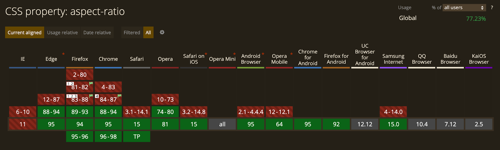
Another way is to employ one of the latest and most welcomed additions to the CSS specification that is aspect-ratio. As the name indicates, it lets you set the aspect ratio of an element and maintains it automatically when the element shrinks or grows. This is achieved with a singular CSS property.
Although it is still in Working Draft at the time of this writing (November 2021), it has already been widely adopted by the latest version of most modern browsers.
Needless to say, this is the long-waited, simplest, cleanest, non-hacky, proper native way of setting aspect ratio on elements.
However, should you wish to have legacy support, we could use the @supports feature of CSS and pseudo-element tactic to add the aforementioned padded-box method as fall-back for older versions of browsers.
The following is an example using this new property with fallback on CodePen.
See the Pen Responsive iframe using aspect-ratio property (the proper way) by StreamShark (@streamshark) on CodePen.
Method 3: Responsive iframe with fixed aspect ratio (the JS way)
Last but not least, JavaScript is also a handy tool for achieving this goal. Assuming that you had a lot of videos (or even just one) all embedded on the same page, and you did not want to deal with all the tagging and styling, then the most efficient way would be to use JavaScript to systematically set the aspect ratio of all the videos at once.
There are libraries, like FitVids.js, for doing this kind of work, but they often only support certain video vendors such as YouTube and Vimeo.
The following is an example on CodePen using vanilla JavaScript demonstrating how it is done. The JS part is a self-invoking function that works out of the box, so you could copy and paste it if you wanted to.
See the Pen Responsive iframe with fixed aspect ratio (the JS way) by StreamShark (@streamshark) on CodePen.
Conclusion
Overall we’d recommend Method 2 as it supports the latest method of embedding videos, along with a fall back to the older padded-box method.
If you’re dealing with a large volume of videos that have already been embedded, then the JavaScript method might suit you best.